

Til Gards
Bachelorproject
For my bachelors dissertation, I decided to create a brand focusing on improving what eco-friendly packaging is.
Design, 3D Design and Text by
Sebastian Tharaldsen
When working with branding, a great way of reaching the consumers is by designing with emotions in mind. I wanted to create a new producer of great ecological food grown and bred on small and sweet farms in Norway. I created a farming collective of 20 small farms, going together to make great food all through the brand 'Til Gards'. The name 'Til Gards' was derived from a Norwegian phrase going "Velkommen til gards", meaning welcome to the farm. I had already created an association for Norwegians with the name, and the perfect combination with the name was of course to include the small farm culture into the brand.


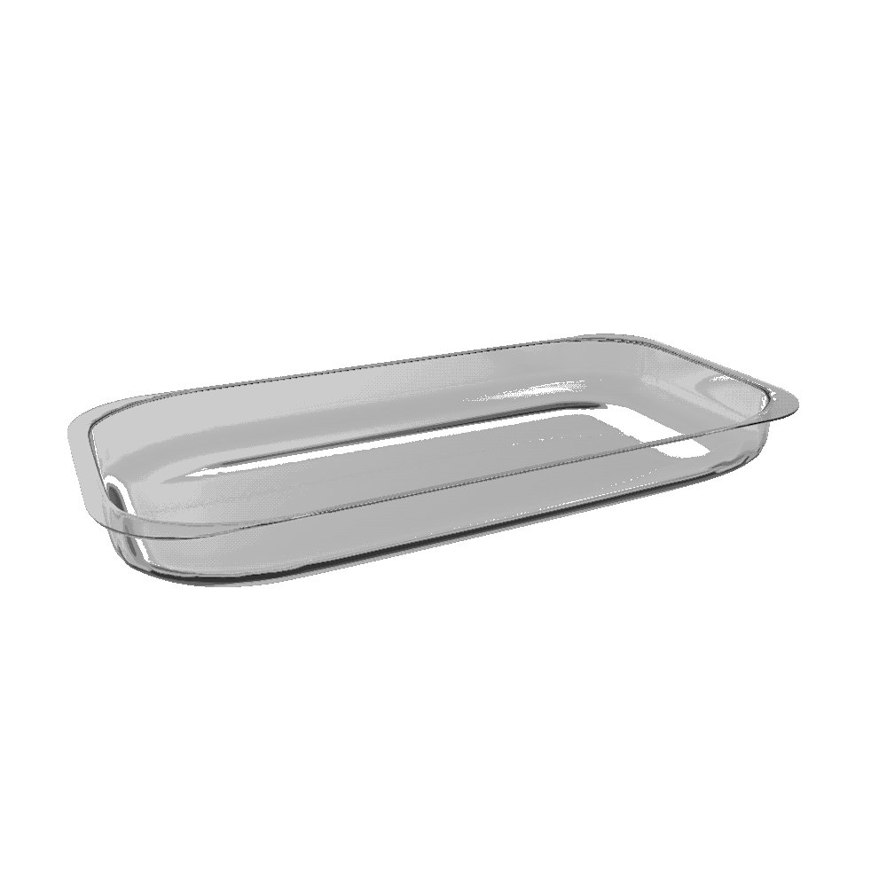
I started the project by creating several different designs for portion-based packaging. The packaging was designed to fit two portions, both portions being vacuum packed to ensure the quality of the product.


While I had already done a lot to make the packaging as eco-friendly as possible, and also made the product in a way that stops people form throwing a lot of food away, I wanted to go even further. I decided that Til Gards and Infinitum, the corporation in charge of recycling in Norway, would team up to make an even bigger change.
In Norway, a common word is "pant". This means to put plastic bottles into a machine in every grocery store, and the bottles are sent to factories made specifically to melt down all bottles to create new ones.
I wanted to further my project by creating a new machine adding the possibility of recycling the plastic packaging.

Logos and Graphic Elements
During the process of creating the packaging, the brand and the story behind it all, I designed a logo, with color combinations made specifically for each and every one of the different products, with one combination for the primary logo. I also illustrated the animals and vegetables in the products for the different labels.

Websites
Further into the process, I chose to create a website for Til Gards to show their products, what they do, and recipes for their products. I wanted to make it clear that the packaging was fully eco-friendly and recyclable from the second you entered the page.


I also wanted to create an article on Infinitum's own website about the partnership.

Posters
To finish it all off, I decided to create three posters based on the three parts of how you should recycle the packaging. These three posters would all hang together in the right order to create a story for the consumers to get their focus on the concept.


