

Solvin Gård
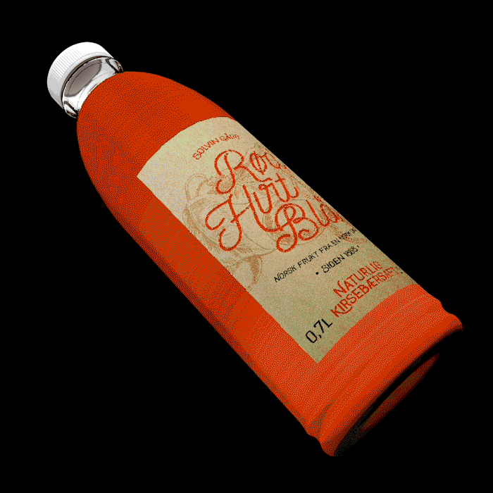
Rød, Hvit & Blå
With Norwegian values in mind, I designed the packaging and the identity for a squash, putting the definition of Norway in a bottle.
Design- and Concept Development by Benjamin Gaupset
Sebastian Tharaldsen
Final Concept, Final Design, Animation and Text by
Sebastian Tharaldsen


For the label on the bottle, the choice was clear. Natural paper was used as a tool for properly communicating the product's values, and make it really feel like a farm-made, handmade product.


For the product's own identity, I created a logo based on Norwegian art and design. The name of the product was created based on the colours in the Norwegian flag; red, white and blue.


A bi-product was also created under the same name. A series om jams based on the same fruits and berries from Gvarv, Telemark, handmade and served in charming mason jars, to make the homemade feeling flourish. Just as the squashes, the jams are made in the series of red, white and blue fruits and berries, all fresh and perfect, made, of course, in Norway, by Norwegian farmers.

